
Designing a scalable booking workflow
for a pet-care CRM
Gingr runs the back office for dog daycares, boarding facilities, and grooming salons. Redesigned the booking and service scheduling experience for a pet care management platform. From system audit to rapid prototyping in high-fidelity.
↓ Scroll down to explore
Gingr: pet-care booking workflow redesign
Gingr is CRM software that runs daily operations for pet-care businesses: daycares, boarding facilities, and grooming salons. This project redesigned its highest-frequency used, highest-friction workflow: booking a reservation. By reorganizing customer and pet data around the task, breaking one long form into a guided flow, and rebuilding the result in real front-end code, the goal was a prototype staff could actually use, and something an engineer could actually build from.
Streamlined the workflow
Turned one long form into a guided, 3 steps flow for front-desk staff.
Consolidated fragmented data
Customer, pet, and service info now live inside the workflow, not scattered across tabs.
Shipped real front-end code and protoype
Rebuilt in HTML/CSS/JS with Cursor and Claude, so it opens in a browser instead of just a mockup.
Built a reusable pattern
The progressive-disclosure structure could extend to other CRM booking features.
Booking touches everything else
CRM tools are the backbone of pet-care businesses: one system runs the whole day, from the front desk to the kennel. In a scan of public user feedback across the category, Gingr's CRM consistently surfaced as a major pain point.
Core problem
Booking is the highest-frequency used task in the system, and today it's one long form: staff can't see service conflicts, pet history, or staff availability until they've already committed to a reservation. Four patterns showed up repeatedly:
Why booking?
Four candidate areas came out of research. Booking was the clear starting point: highest frequency, the widest reach across other modules, and a scope realistic for a 4-hour, AI-assisted build.
Opportunity
Booking touches nearly every other module (customers, pets, staff, calendar, payments) and breaks down fastest under ordinary edge cases. That combination of high frequency, high friction, and a scope small enough to prototype well solo made it the right entry point, rather than trying to rework the whole CRM.
What this redesign had to solve
Primary goals
Building evidence from public signals
With no access to Gingr's internal users, data, or support tickets, this research had to be built entirely from public signals. AI tooling didn't replace my thinking — it changed where I spend my time.
- The designer's role shifts from screen-maker to decision navigator.
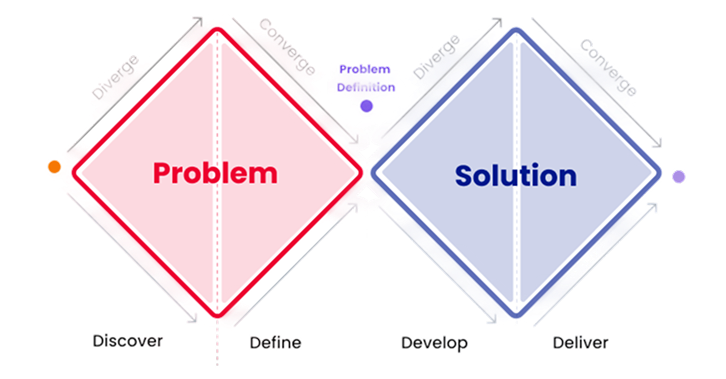
- The Double Diamond still matters, but execution inside each phase just moves faster.
- Less time on static mockups, more time on working prototypes.
Competitor audit
Direct comparison across four category peers to see how each one handles booking, scheduling, and multi-pet workflows.
Public review mining, with Python
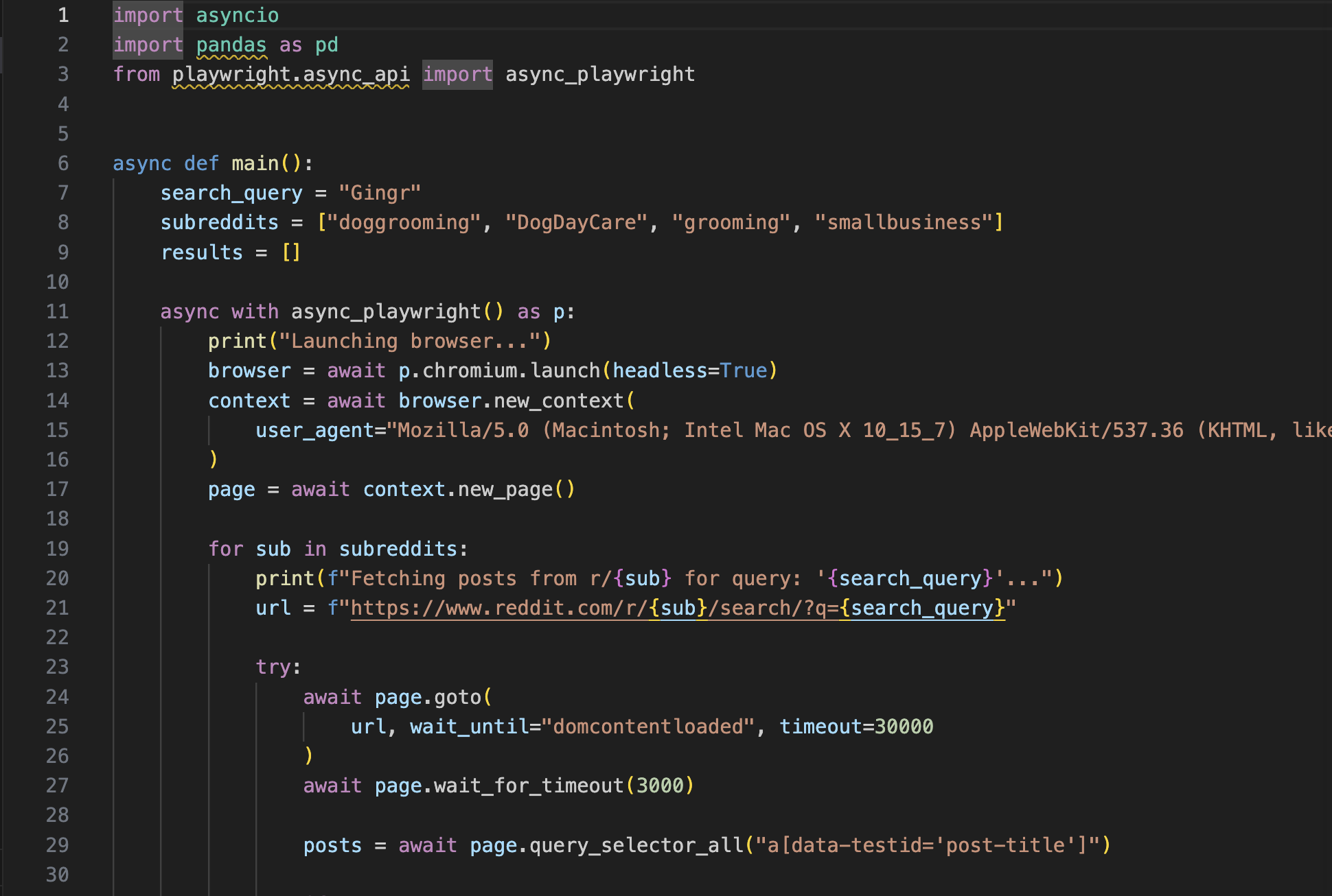
Public documentation, marketing screenshots, and review sites stood in for interviews and support-ticket data I didn't have access to. I used Python to scrape and cluster keywords from Reddit threads and review platforms like GetApp and Capterra, rather than reading each review in isolation.
"Customer service is now at the bottom of their list… entirely unreachable. The platform is very buggy — try sending any normal pixel-sized picture."— Tiffany T. on GetApp, 2026
"You can not book multiple dogs with different groomers. If you break up the appointment, you can not check out with one ticket… the calendar is hard to read."— Reviewer on Capterra, 2026
AI-assisted pattern clustering
Fed the scraped review data into an LLM to surface recurring patterns, like the repeated complaints about multi-pet and multi-groomer bookings, instead of manually tagging each data point one at a time.
Workflow mapping & prioritization
Mapped the findings into a CRM workflow model (create, update, use, propagate) and identified the recurring frictions within it. From there, prioritized opportunity areas based on frequency, friction, and design leverage. AI accelerated the synthesis layer; the framing, prioritization, and design judgment stayed mine.
Four rules that shaped every screen
Bring CRM data into the workflow
Surface critical CRM data at the exact point of decision, not off in a separate tab. Directly addresses fragmented information: staff no longer have to leave the flow to find what they already know.
Allow progressive completion
Let staff move forward with partial information instead of forcing full completion upfront. Reveal the next step only once it's relevant.
Surface constraints earlier
Set constraints, like conflicts or availability, before the user commits to a path, not after. Directly reduces the rework caused by hidden dependencies.
Support multi-entity scenarios
Hold complexity like three dogs, one groomer, two services without breaking task continuity. Directly addresses edge cases like multi-pet or multi-groomer bookings.
Why this approach
Held together, these four principles created real tension, not just wins. Prioritizing customer context over open availability, or clarity over speed, meant giving something up on the other side. Those tradeoffs, and why they were worth making, come next.
Two moments, redesigned end to end
The dashboard staff land on every day, and the booking flow itself, all the way from the entry point to a confirmed reservation.
Watch the prototype in action
A walkthrough of the coded build running in the browser, not a click-through mockup.
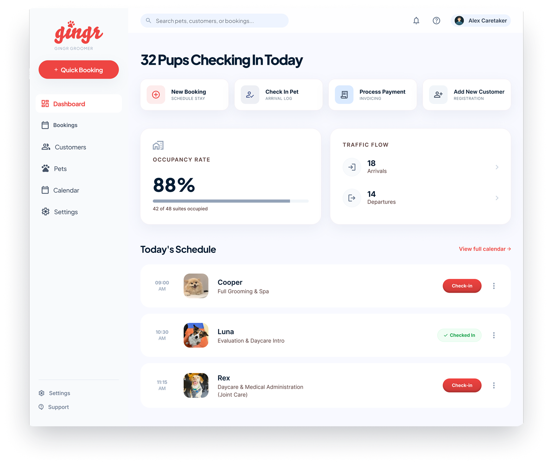
Entry Dashboard: From a status report to a control center
The old dashboard was a dense operations log. It was accurate, but it didn't tell staff what to do next. The redesign leads with today's actions, not yesterday's data.
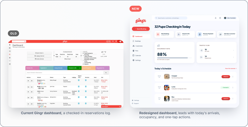
Clear workflow entry
One-tap actions for the day's most common tasks. Reducing cognitive load and making actions more direct.
Information hierarchy
Allowing users to prioritize what to act on versus what to monitor.
Action visibility
Check-in status lives directly on each schedule row. Reducing interaction cost and improving task completion speed.
Booking: One long form becomes a guided flow
The old reservation form asked for location, type, pet, and dates all at once, with no sense of progress. The redesign breaks it into three legible steps: Customer, Booking Type, Services.
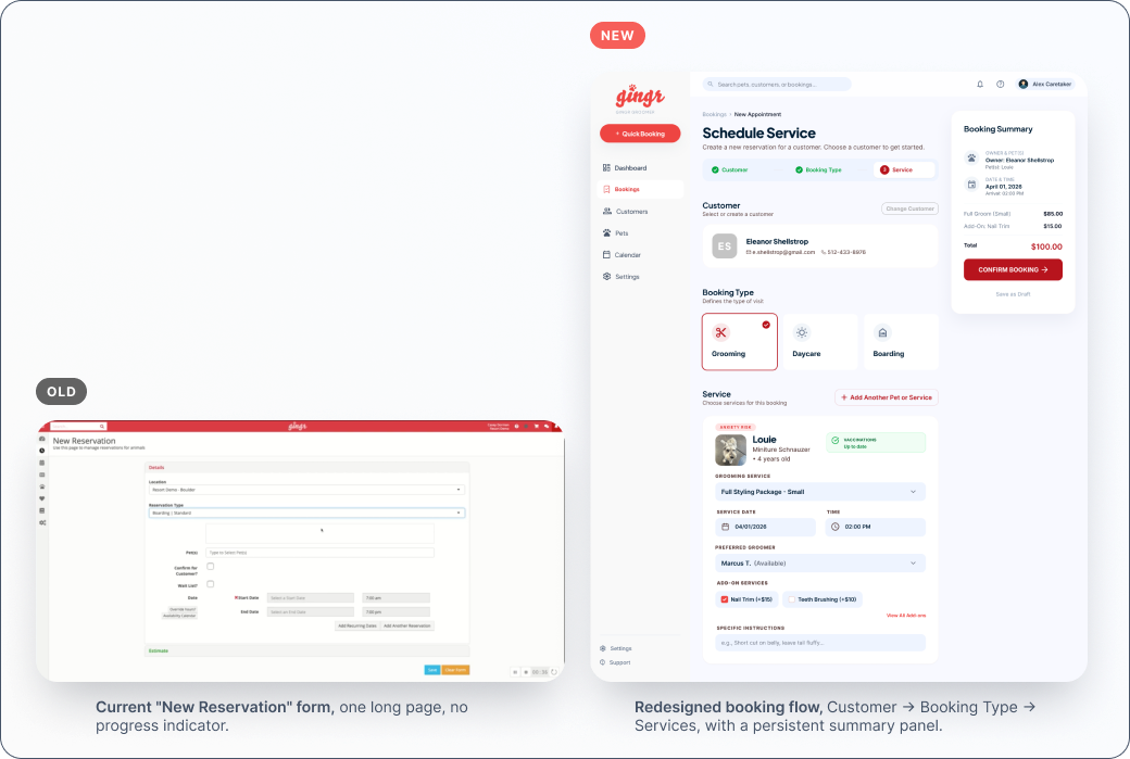
Guided 3-step flow
Customer → Booking Type → Services replaces one long form, so progress and the next step are always clear.
Customer-first, multi-pet model
Reflects real behavior, where one owner can manage multiple pets and bundle several services into a single booking.
CRM context, surfaced automatically
Pet history, vaccination status, and preferred groomer appear right where the decision is made, no need to look them up.
Dependencies and cost made visible
The persistent summary panel shows what's required next and keeps a running total, so nothing has to be tracked mentally. Providing continuous feedback and reducing the need for mental tracking.
Two tradeoffs, made honestly
Two calls in this redesign came with a real cost on the other side. Naming them honestly is part of the design work.
Booking can start from the customer or from the service. I chose customer-first because Gingr's most loyal users are repeat customers with known pets, and the CRM's data model is built around the customer record.
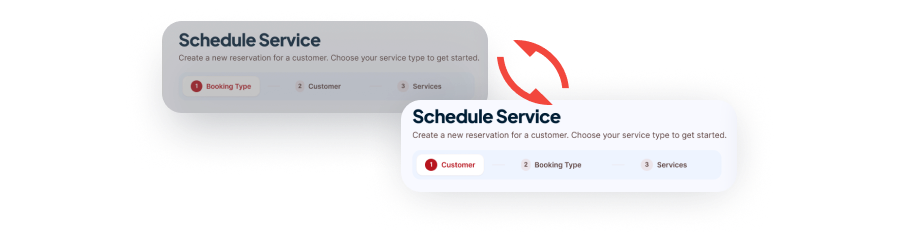
Faster repeat bookings, pet history pulled in automatically, fewer duplicate records.
Front-desk-heavy businesses that think in open service slots first take one extra step.
Grouping booking type, then service, then add-ons keeps the system's structure legible one step at a time. That gives staff a clearer mental model and a cleaner structure to price, schedule, and validate against, at the cost of a slightly longer flow than one dense screen, which could feel faster to someone who already knows exactly what they want. I prioritized clarity first, since this is a workflow-heavy CRM that benefits from stronger guidance, and would solve speed through interaction patterns like better defaults and quick actions rather than collapsing the data model.
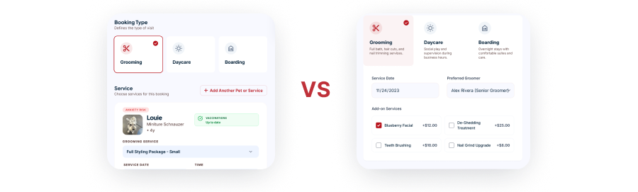
New or infrequent staff can complete a booking correctly without memorizing the structure.
A longer, more structured flow. Experienced users lose the single dense screen that felt faster for mixed bookings.
Designed in Figma. Rebuilt in code.
The differentiator of this project isn't just the design. It's that the design didn't stop at Figma.
Rebuilt in code with Cursor
Every screen in this case study, old-state references aside, was taken from a Figma frame to real, running HTML/CSS/JS using Cursor, then iterated directly against the four design principles above. That's the difference between a designer who hands off a click-through mockup and one who hands off something that opens in a browser, with real markup an engineer can read, adjust, and build from directly.
To be direct about scope: this was a solo project without an engineering team to actually receive the handoff, so "reads like a real build" is a claim about how it's constructed, not a tested claim about handoff smoothness in practice. A recorded walkthrough of the live prototype could be added next.
<div class="booking-summary">
<h3>Booking Summary</h3>
<div class="pet-row" data-pet="louie">
<!-- pulled from CRM record -->
<span class="flag anxiety">Anxiety risk</span>
<span class="flag vax-ok">Vaccinations up to date</span>
</div>
<div class="total">$100.00</div>
</div>
What I'd do with more time
Key Learnings
- AI tooling shifts the designer's role from screen-maker to decision navigator. The thinking doesn't get faster, the execution does.
- Speed doesn't remove the need for design principles. If anything, it makes them the fastest way to check a decision without a live user to ask.
- A working prototype isn't just faster to test. It's concrete enough to bring engineers into the conversation early, instead of after the design is already called "final."
Future Improvements
- Advanced scenarios: overlapping schedules, waitlists, and exception handling.
- Sharper system feedback: clearer communication of conflicts, constraints, and recovery paths.
- AI-predicted attention heatmaps for fast, directional feedback before investing in full usability testing.
- Usability testing with real front-desk staff. Every decision here is grounded in research and principles, not yet validated with the people who'd use it daily.